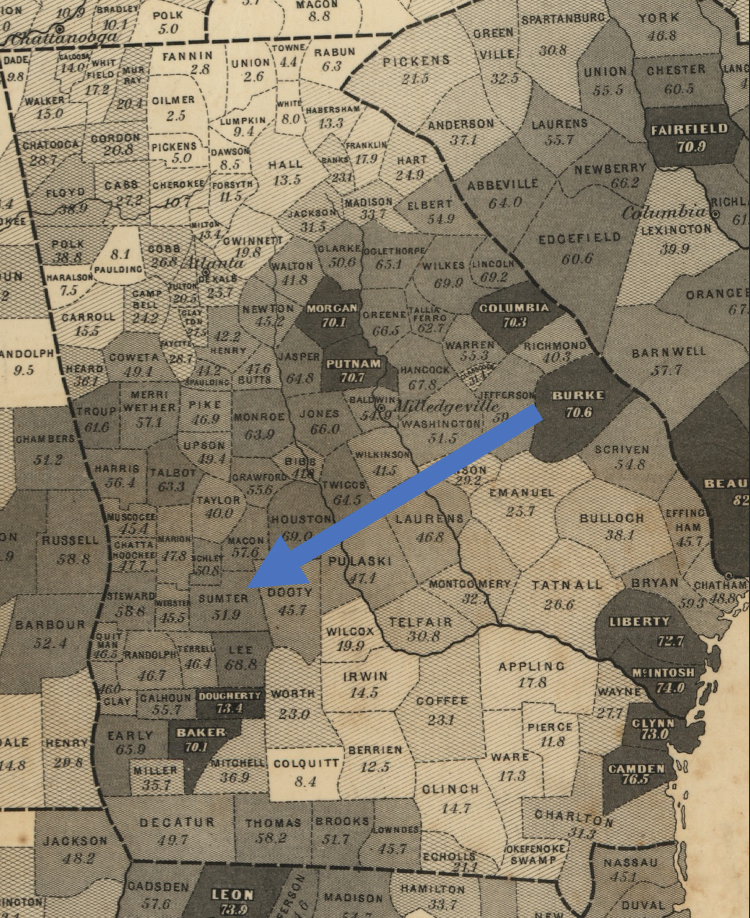
The number in each county represents the proportion of people who were enslaved. Detail of Edwin Hergesheimer, “Map showing the distribution of the slave population of the southern states of the United States. Compiled from the census of 1860,” Library of Congress.
